In this article, I will collect & introduce to you some tips which you can play with Joomla's template to setup your website beautifully, quickly and security.
1. Uninstall unnecessary templates
If you don't use a template, let remove it. Less code that means your website is more lightweight, faster and more security. Below the steps to install a template:
- Go to menu Extensions >> Manage >> Manage
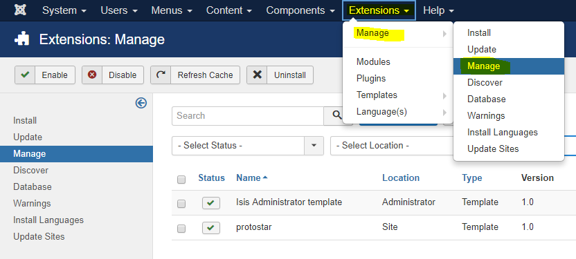
- Click Search Tools button >> select type as Template >> click the check box of a template wanted to install >> click Uninstall button.

This will remove permanently all source code of the template from your site.
2. Edit source code of a template, code your website on mobile devices
Joomla 3.x provides an editor for editing source code of any template. It is very powerful. I think it is a strength of Joomla against the other CMS. With this editor, you can code your website when you are travelling on mobile devices like smart phone or tablet.
To open the editor for your template, go to Extensions >> Templates >> Templates >> click on the template name:

It will open a screen with files & folders of source code in left side. Here you can do many actions via buttons on the top. Click Documentation button if you want to learn more about this editor. To edit a file, click on its name:


Above are buttons I often use. The right side is source code of selected file. To change for editing the other file, just click on its name. Soo cool 👍
3. Compile LESS file
Another weapon of Joomla is it supports to compile LESS file directly on the template editor. You don't need to install any extra tool. To know what is LESS, let read: http://lesscss.org.
LESS files are often in less folder. If you open a LESS file on the editor, it will show Compile LESS button. After compiling, it will translate into a CSS file corresponding with LESS file in css folder. The template file uses CSS file to present its styles.

4. Create overrides for extensions
In manual way, you must copy the original PHP file from the source of extension into a proper place in your template directory. The correct directory structure for your override file is:
templates/TEMPLATE_NAME/html/EXTENSION_NAME/VIEW_NAME/FILE_NAME.php
You can read here for an example.
However in Joomla 3.x, you can also create overrides for extensions by clicking Create Overrides tab then click an extension (module, component, layout) which you want to override in the template manager.

5. Customize Protostar template
As a beginner of Joomla template coding, one of the fastest way is studying & customizing an existing template. What is good template for you starting? I recommend the Protostar template. It is one of the two front-end templates included with a Joomla 3.x source code. Protostar likes a blank responsive template, it is simple but displays well on many devices. So you can build your own template from this template with a basic knowledge about PHP, JavaScript & CSS.
In this section, I give an example on how to create a mobile menu which displays all submenus without touching on parent menu. By default, a submenu will be showed when hovering on parent menu. You can do this action on desktop with mouse, but cannot in a mobile with touching screen. It causes your submenu is never reached on the mobile.
By adding below code into template.less file (in @media query for mobile screen) and re-compile it in the template editor, you will have a proper menu on mobile:
@media (max-width: 480px) {
//start changes
    .navigation .nav-child {
        display: block;
        position: unset;
        float: unset;
        border: unset;
        box-shadow: unset;

        &:before {
            display: none;
        }
    }
    .navigation .nav > li > .nav-child {
        &:before {
            display: none;
        }
    }
//end changes
    .item-info > span {
        display:block;
    }
    .blog-item .pull-right.item-image {
        margin:0 0 18px 0;
    }
    .blog-item .pull-left.item-image {
        margin:0 0 18px 0;
        float:none;
    }
}
Here are screens for desktop and mobile:


It's time to go to bed. Bye everyone! Any comment is welcome.


No comments:
Post a Comment